Showing posts with label Arctic Ocean. Show all posts

Monday, December 5, 2022

Arctic Ocean overheating

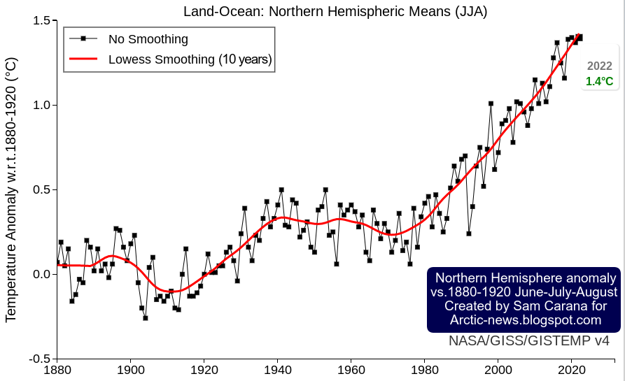
Arctic sea ice extent was 10.31 million km² on December 4, 2022. At this time of year, extent was smaller only in two years, i.e. in 2016 and 2020, both strong El Niño years. With the next El Niño, Arctic sea ice extent looks set to reach record lows. 


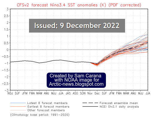
The NOAA image on the right indicates that, while we're still in the depths of a persistent La Niña, the next El Niño looks set to strike soon.

The image below shows high sea surface temperature anomalies near the Bering Strait on December 2, 2022, with a "hot blob" in the North Pacific Ocean where sea surface temperature anomalies are reaching as high as 7°C or 12.6°F from 1981-2011. The Jet Stream is stretched out vertically from pole to pole, enabling hot air to enter the Arctic from the Pacific Ocean and from the Atlantic Ocean.


The image below shows a forecast for December 5, 2022, of 2m temperature anomalies versus 1979-2000, with anomalies over parts of the Arctic Ocean near the top end of the scale.


On December 6, 2022, the Arctic was 6.63°C or 11.93°F warmer compared to 1979-2000, as illustrated by the image below. 


The image below shows the daily average Arctic air temperature (2m) from 1979 up to December 6, 2022.


Given that we're still in the depth of a persistent La Niña, these currently very high air temperature anomalies indicate that ocean temperatures are very high and that ocean heat is heating up the air over the Arctic. 

Additionally, ocean heat is melting the sea ice from below. 

Accordingly, Arctic sea ice has barely increased in thickness over the past 30 days, as illustrated by the navy.mil animation on the right.

This leaves only a very short time for Arctic sea ice to grow back in thickness before the melting season starts again, which means that there will be little or no latent heat buffer to consume heat when the melting season starts. 

Furthermore, rising temperatures and changes to the Jet Stream contribute to formation of a freshwater lid at the sea surface at higher latitudes, resulting in further heating up of the Arctic Ocean. 

As a result, more heat threatens to penetrate sediments at the seafloor of the Arctic Ocean that contain vast amounts of methane in hydrates and free gas, and result in abrupt release of huge amounts of methane, dramatically pushing up temperatures globally. 

[ The Buffer has gone, feedback #14 on the Feedbacks page ]

The situation is dire and the right thing to do now is to help avoid or delay the worst from happening, through action as described in the Climate Plan.


Links

• Vishop sea ice extent
https://ads.nipr.ac.jp/vishop/#/extent

• NOAA ENSO: Recent Evolution, Current Status and Predictions
https://www.cpc.ncep.noaa.gov/products/analysis_monitoring/lanina/enso_evolution-status-fcsts-web.pdf

• nullschool.net
https://earth.nullschool.net

• Climate Reanalyzer
https://climatereanalyzer.org

• Naval Research Laboratory - HYCOM Consortium for Data-Assimilative Ocean Modeling
https://www7320.nrlssc.navy.mil/GLBhycomcice1-12/arctic.html

• Albedo, latent heat, insolation and more

• Cold freshwater lid on North Atlantic

Thursday, September 29, 2022

Crossing 3C

The Northern Hemisphere is where most people live. Furthermore, most people live on land. Let's first look at the temperature rise on the Northern Hemisphere. 

The image below, created with a September 30, 2022 screenshot from NASA customized analysis plots, shows June-July-August temperature anomalies from 1880-1920 on the Northern Hemisphere with June-July-August 2022 highlighted with an anomaly of 1.4°C or 2.52°F, a record high in a tie with 2020. 


Secondly, most people live on land. The image below shows the monthly mean global surface temperature anomaly on land. It is similarly created with a September 30, 2022 screenshot from NASA customized analysis plots and shows a peak anomaly from 1880-1920 of 2.95°C or 5.31°F (for February 2016, land only).


The year 2016 was an El Niño year. During an El Niño, temperatures are higher than usual. We are currently in the depths of a persistent La Niña, which suppresses temperatures. We look set to move into another El Niño within years. 

In conclusion, the temperature rise on land on the Northern Hemisphere looks set to cross 3°C soon, the more so since we are also facing a peak in sunspots (by 2025), which may coincide with peak temperatures associated with the upcoming El Niño. Also keep in mind that the above temperature anomalies are measured from 1880-1920, so the temperature rise from pre-industrial is significantly higher than that. 


There are further events and developments that could additionally speed up the temperature rise, as discussed at the extinction page. Humans are likely to go extinct with a rise of 3°C, as illustrated by the above image, from an analysis discussed in an earlier post.

Methane levels keep rising

The image below, from an earlier post, shows annual global mean methane with a trend added that points at a methane rise that could in 2028 represent a forcing of 780 ppm CO₂e (with a 1-year GWP of 200).

In other words, the clouds tipping point at 1200 ppm CO₂e could be crossed in 2028 due to the forcing of methane and CO₂ alone, assuming that CO₂ concentration in 2028 will exceed 420 ppm. Moreover, this could happen even earlier, since there are further forcers, while there also are further events and developments that could additionally speed up the temperature rise, as discussed in earlier posts such as this one. Furthermore, the NOAA data used in the above image rise are for marine surface measurements. Methane is accumulating at higher altitude, as illustrated by the compilation images below. 


The top image of above compilation image shows that the MetOp-B (also known as MetOp-1) satellite recorded a mean methane concentration of 1979 parts per billion (ppb) at 293 mb on September 30, 2022 pm. 

The above compilation image shows high concentrations of methane close to sea level, all the way up to the Tropopause. Does this indicate that methane is rising up from the seafloor of the Arctic Ocean?  

Polar Jet Stream (blue) and Subtropical
Jet Stream (red) - NOAA image
Let's first take a look at prevailing wind pattern and how they changed. On the Northern Hemisphere, the coldest point used to be the North Pole, so wind used to flow from the tropics to the North Pole.

This and the deflection due to the Coriolis force resulted in two Jet Streams forming, circumnavigating the globe in what used to be narrow and straight bands, i.e. the Polar Jet Stream at 60° North and the Subtropical Jet Stream at about 30°, both on the Northern and Southern Hemisphere, resulting in a total of four Jet Streams.

The Jet Stream used to circumnavigate the globe in narrow and straight bands, predominantly following a path from East to West, in line with its strength and with this deflection.

Polar Jet Stream and Subtropical Jet Stream - NOAA image
The Jet Stream used to circumnavigate the globe at specific latitudes, as illustrated by the images on the right.

Prevailing wind patterns cause carbon dioxide to accumulate at the poles, as illustrated by the image underneath on the right that shows a high carbon dioxide concentration of 235 ppm over the North Pole. 

Some things changed as, due to emissions by people, the difference in temperature between the Arctic and the Tropics narrowed. 

This decreases the speed at which heat is moving to the North on the Northern Hemisphere and it deforms the Jet Stream and the prevailing wind patterns, which can make it even more easy for methane that is released from the Arctic Ocean to rise up and accumulate at the Tropopause, and move from there toward the Equator as it rises. 

Emissions by people are also causing the Troposhere to expand. 

Note the important difference in weight between carbon dioxide and methane. Carbon dioxide tends to accumulate at lower altitudes since it is heavier than air. Methane, on the other hand, is lighter than air, causing methane to rise and accumulate at altitudes near the Tropopause, from where methane moves closer to the Equator, since the Tropopause is higher in altitude at the Tropics than at the Poles. 

The accumulation of methane at higher altitudes is further illustrated in the compilation image below that shows that methane mean levels are highest where the troposphere ends over the Arctic. 


The situation is dire and the right thing to do now is to help avoid or delay the worst from happening, through action as described in the Climate Plan.


Links

• NASA - GISS Surface Temperature Analysis
https://data.giss.nasa.gov/gistemp/graphs_v4/customize.html

• Cataclysmic Alignment
https://arctic-news.blogspot.com/2022/06/cataclysmic-alignment.html

• Sunspots
https://arctic-news.blogspot.com/p/sunspots.html

• Pre-industrial
https://arctic-news.blogspot.com/p/pre-industrial.html

• When will we die?
https://arctic-news.blogspot.com/2019/06/when-will-we-die.html

• Extinction
https://arctic-news.blogspot.com/p/extinction.html

• Blue Ocean Event 2022?

• Jet Stream

• nullschool.net

Friday, December 23, 2016

Accelerating Warming of the Arctic Ocean


Stronger Winds causing further Warming of the Arctic Ocean

Warming is accelerating in the Arctic. On December 22, 2016, the Arctic was on average 3.33°C or 5.99°F warmer than it was in 1979-2000.


Within the Arctic, the Arctic Ocean is warming most rapidly. The image below gives a snapshot of the situation on December 22, 2016 at 06:00 UTC. The Arctic as a whole was as much as 3.34°C or 6.01°F warmer than in 1979-2000. At the same time, temperatures over much of the Arctic Ocean were at the top end of the scale, i.e. as much as 30°C or 54°F warmer than in 1979-2000 (pink color at 90°N latitude).


The temperature in the Arctic (north of 80°N Latitude) is also illustrated by the image below. The red line of the temperature for 2016, up to December 22, 2016. The green line is the 1958-2002 temperature.


Over the entire year 2016, warming was most profound over the Arctic Ocean, which was more than 2.5°C or 4.5°F warmer than 1981-2010, as illustrated by the image below.


The animation below illustrates how this anomaly developed over the past few years, each time showing a 365-day period, starting in 2014 and each time shifted by roughly one month.


These high temperatures over the Arctic Ocean reflect warm water of the Arctic Ocean, with heat added from the Atlantic Ocean and the Pacific Ocean. The image below shows ocean warming, with temperatures rising particularly rapidly on the Northern Hemisphere.

[ Ocean warming, from earlier post ]
Warmer water of the Atlantic Ocean is pushed by the Coriolis force toward the Arctic Ocean. The huge amounts of energy entering the oceans translate not only into higher temperatures of the water and of the air over the water, but also into higher waves and stronger winds.


Above image shows winds on December 29, 2016.

[ click on images to enlarge ]
As above image shows, waves were as high as 7.65 m or 25.1 ft in between Norway and Svalbard on December 29, 2016.


Sea surface temperatures west of Svalbard were as high as 14.6°C (58.2°F) on December 29, 2016. Sea surface temperature went up at the end of December at this spot, while the longer-term average went down in line with the change in seasons.


Underneath the surface of the North Atlantic, the water is much warmer than at the surface, and this temperature difference increases as winds get stronger and cause stronger evaporation, which has a cooling effect on the sea surface. This is illustrated by the image below, showing both the North Pacific and the North Atlantic on November 28, 2016.


The fact that the North Pacific shows a huge cold area, while the cold area in the North Atlantic has virtually disappeared, suggests that the cold area in the North Pacific is not the result of melt-water. The path of the cold areas and the low temperatures over the continents at higher latitudes, give further indications that strong winds are causing such cold areas. The image below shows that a cold area reappearing in the North Atlantic as it gets hit by strong winds (see video further below).


Above images and the image below, from an earlier post, illustrate how stronger evaporation and the resulting precipitation, at times in combination with melt-water, could create cold freshwater lids on both the North Atlantic and the North Pacific. The situation in the North Atlantic is very dangerous, as such a lid can cause much more heat to get carried into the Arctic Ocean underneath the sea surface of the North Atlantic, due to reduced heat transfer to the atmosphere from water on its way to the Arctic Ocean.


The image below, from an earlier post,  shows the depth of Barents Sea, which is relatively shallow around Svalbard.


As the image on the right shows, this spot warms up due to a sea current that brings warm water from the North Atlantic into the Arctic Ocean.

Above images give an indication of the temperature of the water in the Atlantic Ocean underneath the sea surface, as the water comes to the surface near Svalbard, as also illustrated by the plot on the right.

The Arctic Ocean is now warming underneath the sea ice due to the inflow of warm water from the Atlantic Ocean and the Pacific Ocean.

The Arctic Ocean is also warming due to feedbacks such as increased levels of water vapor in the atmosphere, warmer river water running into the Arctic Ocean and soot from wildfires that can settle on snow and ice, resulting in further albedo changes.

Further feedbacks of global warming include warmer air temperatures, higher waves and stronger winds that all speed up the demise of snow and ice.

Stronger winds are pushing warm water from the North Atlantic into the Arctic Ocean. Why are these winds getting stronger? As the Arctic warms faster than the rest of the world, the temperature difference between the Arctic and the Equator decreases, making the Jet Stream wavier, with longer loops extending to the north and to the south. At the same time, the temperature difference between the oceans and the continents (Europe, Asia and North America) is increasing, speeding up the Jet Stream as it travels, e.g., over the North Atlantic towards the Arctic Ocean.

[ click on images to enlarge ]
The above 14.6°C SST on December 29, 2016, near Svalbard is the result of warm water being pushed from the North Atlantic into the Arctic Ocean. The situation is illustrated by the above combination image that shows that the Jet stream is forecast to reach speeds as high as 319 km/h or 198 mph in between North America and Greenland on December 31, 2016 (left panel). At the same time, surface winds are forecasts to reach speeds as high as 95 km/h or 59 mph (center panel) and waves as high as 8.96 m or 29.4 ft in between Norway and Svalbard (right panel).

The situation is further illustrated by the video below, showing winds over the North Atlantic from December 27, 2016 to January 3, 2017, as forecasts by cci-reanalyzer.org.


The fact that this is not a one-off event is also illustrated by the image on the right, showing that the Jet Stream reached speeds of 384 km/h or 239 mph over the Pacific Ocean on December 27, 2015. At the same day and time in 2015, the Jet Stream reached speeds as high as 430 km/h or 267 mph as it moved over North America on its way over the North Atlantic.

In conclusion, increasingly stronger winds are causing huge amounts of heat to enter the Arctic Ocean from the North Atlantic, and also from the Pacific Ocean. As the water of the Arctic Ocean keeps warming, the danger increases that methane hydrates at the bottom of the Arctic Ocean will destabilize.

The danger is illustrated by the two images above and below, recorded by the MetOp2 satellite on the afternoon of Christmas eve and Christmas.


Continued warming could trigger huge abrupt methane eruptions leading to mass destruction and extinction.

Potential warming by more than 10°C or 18°F by 2026 (from: Climate Plan Summary, see also: the extinction page)

The image below shows the associated temperature rise from preindustrial to 2026, with figures discussed in more detail on the Temperature page.


The situation is dire and calls for comprehensive and effective action as described at the Climate Plan.

Two videos complement this. Have a look at the video entitled Abrupt Climate Disrupting Arctic Changes: Part 2 of 2 by Paul Beckwith, in particular the segment from 8:30 to 12:00 minutes where Paul discusses how wind patterns are changing over the Arctic.


For further thoughts on the situation, also have a look at the video below in which Jennifer Hynes interviews Peter Wadhams.


Links

• Climate Plan
http://arctic-news.blogspot.com/p/climateplan.html

• Climate Plan summary
http://arctic-news.blogspot.com/p/summary.html

• Feedbacks
http://arctic-news.blogspot.com/p/feedbacks.html

• Extinction
http://arctic-news.blogspot.com/p/extinction.html

• Temperature
http://arctic-news.blogspot.com/p/temperature.html

• The University Centre in Svalbard: UNIS
http://www.unis.no/

• Danish Meteorological Institute (DMI)
http://ocean.dmi.dk/arctic/meant80n.uk.php

• Monthly CO₂ not under 400 ppm in 2016
http://arctic-news.blogspot.com/2016/11/monthly-co-not-under-400-ppm-in-2016.html

• Methane's Role in Arctic Warming
http://arctic-news.blogspot.com/2016/02/methanes-role-in-arctic-warming.html

• Gulf Stream brings ever warmer water into Arctic Ocean
http://arctic-news.blogspot.com/2015/06/gulf-stream-brings-ever-warmer-water-into-arctic-ocean.html


Sunday, July 17, 2016

High Methane Levels Follow Earthquake in Arctic Ocean

In the 12 months up to July 14, 2016, 48 earthquakes with a magnitude of 4 or higher on the Richter scale hit the map area of the image below, mostly at a depth of 10 km (6.214 miles).


As temperatures keep rising and as melting of glaciers keeps taking away weight from the surface of Greenland, isostatic rebound can increasingly trigger earthquakes around Greenland, and in particular on the faultline that crosses the Arctic Ocean.

Two earthquakes recently hit the Arctic Ocean. One earthquake hit with a magnitude of 4.5 on the Richter scale on July 9, 2016. The other earthquake hit with a magnitude of 4.7 on the Richter scale on July 12, 2016, at 00:15:24 UTC, with the epicenter at 81.626°N 2.315°W and at a depth of 10.0 km (6.214 miles), as illustrated by the image below.


Following that most recent earthquake, high levels of methane showed up in the atmosphere on July 15, 2016, over that very area where the earthquake hit, as illustrated by the image below.


Above image shows that methane levels were as high as 2505 ppb at an altitude of 4,116 m or 13,504 ft on the morning of July 15, 2016. At a higher altitude (of 6,041 m or 19,820 ft), methane levels as high as 2598 ppb were recorded that morning and the magenta-colored area east of the north-east point of Greenland (inset) looks much the same on the images in between those altitudes. All this indicates that the earthquake did cause destabilization of methane hydrates contained in sediments in that area.

Above image, from another satellite, confirms strong methane releases east of Greenland on the afternoon of July 14, 2016, while the image below shows high methane levels on July 16, 2016, along the faultline that crosses the Arctic Ocean.


The image on the right shows glaciers on Greenland and sea ice near Greenland and Svalbard on July 15, 2016. Note that clouds partly obscure the extent of the sea ice decline.


Above image shows the sea ice on July 12, 2016. There is a large area with very little sea ice close to the North Pole (left) and there is little or no sea ice around Franz Josef Land (right). Overall, sea ice looks slushy and fractured into tiny thin pieces. All this is an indication how warm the water is underneath the sea ice.

[ click on image to enlarge ]
In addition to the shocks and pressure changes caused by earthquakes, methane hydrate destabilization can be triggered by ocean heat reaching the seafloor of the Arctic Ocean. Once methane reaches the atmosphere, it can very rapidly raise local temperatures, further aggravating the situation.

Temperatures are already very high across the Arctic, as illustrated by the image below, showing that on July 16, 2016, it was 1.6°C or 34.8°F over the North Pole (top green circle), while it was 32.7°C or 90.8°F at a location close to where the Mackenzie River flows into the Arctic Ocean (bottom green circle).

Arctic sea ice is in a very bad shape, as also illustrated by the Naval Research Laboratory nowcast below.


Sea ice thickness has fallen dramatically over the years, especially the ice that was more than 2.5 m thick. The image below compares the Arctic sea ice thickness (in m) on July 15, for the years from 2012 (left panel) to 2015 (right panel), using Naval Research Laboratory images.

[ Click on image to enlarge ]
The image below shows sea surface temperature anomalies from 1961-1990 on July 24, 2016.


Sea surface temperatures off the coast of America are high and much of this ocean heat will be carried by the Gulf Stream toward the Arctic Ocean over the next few months.


On July 24, 2016, sea surface temperature near Florida was as high as 33.2°C or 91.7°F, an anomaly of 3.7°C or 6.6°F from 1981-2011 (bottom green circle), while sea surface temperature near Svalbard was as high as 17.3°C or 63.2°F, an anomaly of 12.6°C or 22.8°F from 1981-2011 (top green circle).

A cold freshwater (i.e. low salinity) lid sits on top of the ocean and this lid is fed by precipitation (rain, hail, snow, etc.), melting sea ice (and icebergs) and water running off the land (from rivers and melting glaciers on land). This lid reduces heat transfer from ocean to atmosphere, and thus contributes to a warmer North Atlantic where huge amounts of heat are now carried underneath this lid toward the Arctic Ocean. The danger is that more ocean heat arriving in the Arctic Ocean will destabilize clathrates at the seafloor and result in huge methane eruptions, as discussed in earlier posts such as this one.

As temperatures keep rising, snow and ice in the Arctic will decline. This could result in some 1.6°C or 2.88°F of warming due to albedo changes (i.e. due to decline both of Arctic sea ice and of snow and ice cover on land). Additionally, some 1.1°C or 2°F of warming could result from methane releases from clathrates at the seafloor of the world's oceans. As discussed in an earlier post, this could eventuate as part of a rise from pre-industrial levels of as much as 10°C or 18°F, by the year 2026.

[ click on image to enlarge ]


The impact of rising temperatures will be felt firstly and most strongly in the Arctic, where global warming is accelerating due to numerous feedbacks that can act as self-reinforcing cycles.

Already now, this is sparking wildfires across the Arctic.

Above image shows wildfires (indicated by the red dots) in Alaska and north Canada, on July 15, 2016.

The image on the right shows smoke arising from wildfires on Siberia. The image below shows that, on July 18, 2016, levels of carbon monoxide (CO) over Siberia were as high as 32318 ppb, and in an area with carbon dioxide (CO2) levels as low as 345 ppm, CO2 reached levels as high as 650 ppm on that day.

[ click on images to enlarge them ]
The image below shows the extent of smoke from wildfires in Siberia on July 23, 2016.


The image below shows high methane levels over Siberia on July 19, 2016.


The image below, from the MetOp satellite, shows high methane levels over Siberia on July 21, 2016.

Below are further images depicting mean global methane levels, from 1980-2016 (left) and 2012-2016 (right).

The image below shows methane levels at Barrow, Alaska.


The image below shows that, while methane levels may appear to have remained stable over the past year when taking measurements at ground level, at higher altitudes they have risen strongly.


The conversion table below shows the altitude equivalents in feet, m and mb.
57016 feet44690 feet36850 feet30570 feet25544 feet19820 feet14385 feet 8368 feet1916 feet
17378 m13621 m11232 m 9318 m 7786 m 6041 m 4384 m 2551 m 584 m
 74 mb 147 mb 218 mb 293 mb 367 mb 469 mb 586 mb 742 mb 945 mb

The situation is dire and calls for comprehensive and effective action, as described at the Climate Plan.